6 Best About Me Page Options for 2024

The About Me page is an essential component of any website. This dedicated space offers a unique opportunity to engage site visitors by sharing your personal story and showcasing your brand.
As one of the top website builders for small businesses, Website Builder makes turning your ideas into a fully functional website simple and quick. With its AI-driven capabilities and a flexible drag-and-drop page editor, creating an impactful About Me page becomes a straightforward process.
This article aims to serve as a source of inspiration by exploring great page examples created with Hostinger Website Builder. We’ll also look at how you can use our builder templates to create an About Me page for your site.
Download Website Launch Checklist
6 About Me Page Examples
We’ve curated a list of six creative About Me page design examples worth checking out. They blend compelling website content with company values, achieving personal brand storytelling that engages visitors and builds trust.
1. Anulika Nwankwo
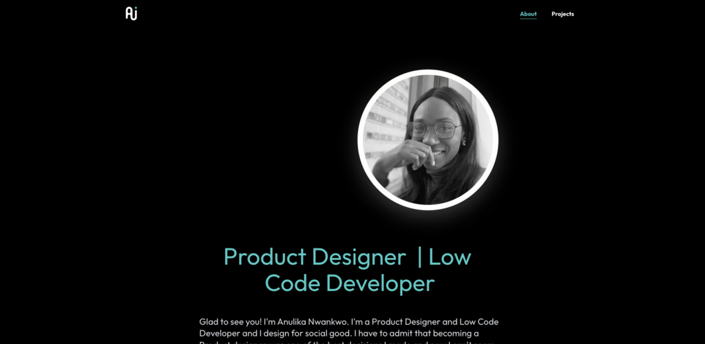
Crafting effective About Me pages starts with sharing your personal or company story. This product designer’s page provides a clear and concise overview of her professional journey, establishing her brand as a product designer and low-code developer.
Her mission statement comes through clearly – she designs for social good. This adds a personal connection with visitors, who are likely to resonate with her commitment to social responsibility. The page also showcases her approach to user-centric design and data-driven decisions.
The page’s responsive design aesthetic, complete with creative visuals, enhances its visual appeal and offers an engaging user experience. The current reading list is an interesting touch to this Meet the Owner page, helping her reveal her personality further.
This About page effectively builds trust and aims to connect directly with each potential client, setting a strong example for small businesses looking to establish a meaningful online presence.
2. Borhen Kacbouri
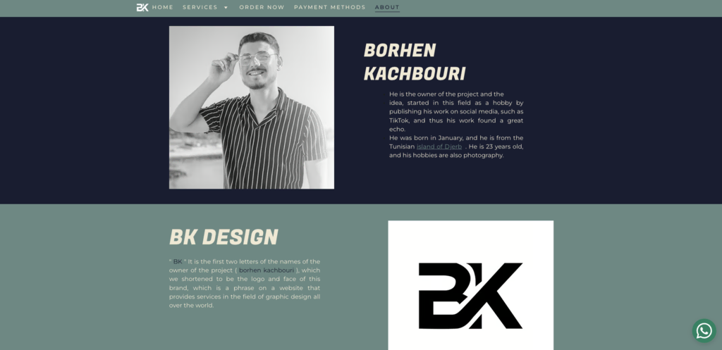
This page is a prime example of how to craft an effective About section. The page is simple and easy to navigate, letting website visitors quickly understand his story in graphic design.
When writing impactful About Me content, simplicity is often key – don’t hide behind complex and important-sounding words. Instead, aim to use clear and concise language, like this example did.
The text on the page aligns with the overall company’s core values and brand voice, making his small business cohesive, relatable, and trustworthy.
As a graphic designer, his About page design showcases an understanding of clear and dynamic web design. High-quality website multimedia – in this case, a handful of images – and a clean overall aesthetic give potential customers an idea of the level of service to expect.
The page also effectively highlights his experience, background, and TikTok fame – features useful for showcasing brand identity and connecting with website visitors.
3. Sparrow Flies
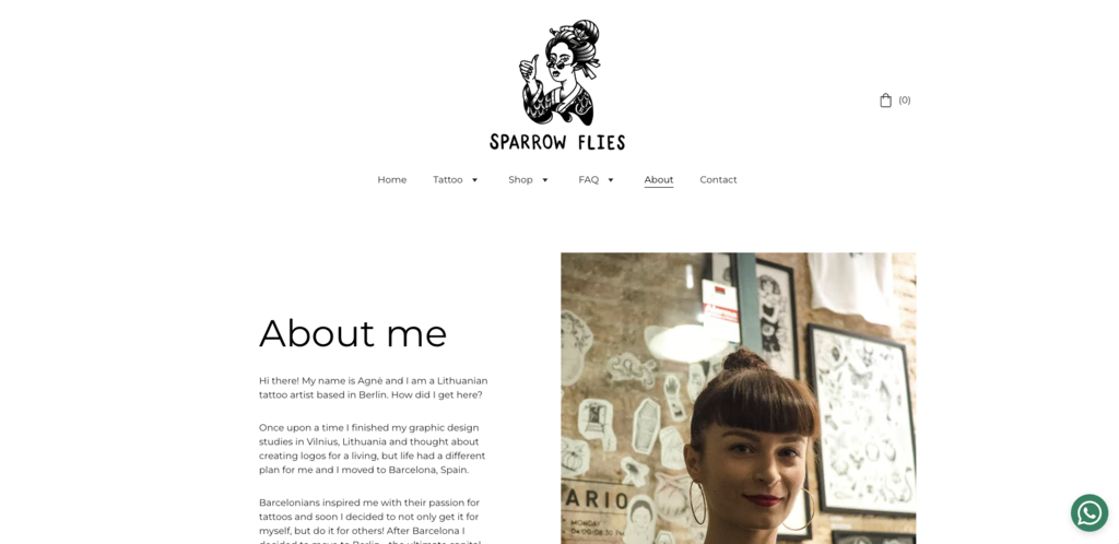
The About page of Sparrow Flies Tattoo exemplifies the key principles of an effective About Me page. It is clear and concise, providing a brief overview of the her journey from studying graphic design to becoming a tattoo artist. There’s no industry jargon, making it easy for anyone to understand.
This one page effectively communicates her genuine passion for tattoo artistry, specifically in Irezumi, neo-traditional, ukiyo-e, and flora and fauna-themed tattoos, creating an authentic connection with the audience.
The ample use of whitespace enhances the page’s visual appeal, providing an engaging user experience for her website visitors.
The inclusion of the studio’s working hours and contact information in the footer also helps customers reach her.
4. Dr Gillian Jack
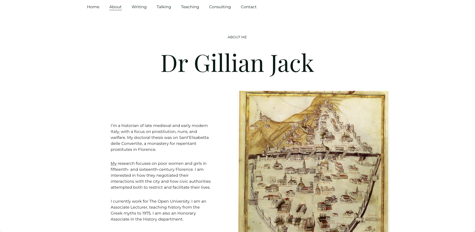
This About Me page offers a concise overview of her qualifications. She effectively details her academic background, research interests, and current role without unnecessary jargon. This makes the page easily digestible for a broader audience.
Her unique research focus on poor women and girls in 15th and 16th-century Florence gives her a distinct academic identity. This authenticity not only highlights her passion but also differentiates her in her field.
Enhancing the user experience, the page’s simple yet professional visual design is complemented by a high-quality image of a historical map, assumingly from her research. If you want to showcase brand authenticity on your site, consider adopting a similar approach when it comes to visuals.
The up-to-date information, specifically mentioning her current position at The Open University, builds trust and demonstrates her ongoing commitment to her academic career.
5. Anna Babich
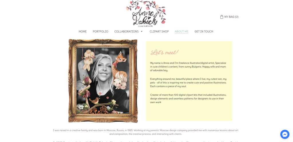
The written content on this About Me page clearly outlines her professional journey in design, being accessible to customers and industry peers alike.
Her company’s history is authentic, starting from her creative upbringing in Moscow to significant career milestones, including collaborations with Creative Market. This increases her credibility with the reader and provides insight into her company culture and business goals.
The page highlights her unique expertise in children’s content, offering compelling reasons for a potential customer to consider her services. Her creative projects in this field build trust and showcase her brand style effectively.
Important elements like her business model, target customer, and niche – children’s content – are clearly stated, rounding out this effective and engaging About Me page.
6. Petratherapy
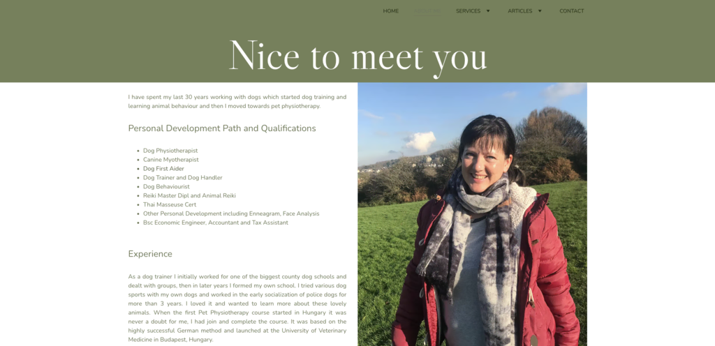
Petratherapy’s About Me page offers a straightforward look into the company’s story and the founder’s expertise in pet physiotherapy. The language is jargon-free, making the information easy to follow for all visitors.
The page effectively highlights the founder’s unique qualifications and services without resorting to hard selling. This can be an important element for her target audience, who want to know that their pets will be in safe and capable hands.
Visually, the page is enhanced by a curated image gallery featuring dogs, the focus of the therapy services. This not only captivates the audience but also highlights the founder’s expertise and commitment to animal care.
The gallery, coupled with the page’s straightforward content and design, makes it a comprehensive and engaging landing page for new customers.
Top 10 About Page Template Options
Choosing the right template isn’t just about how it looks. It should help you connect with your target audience, reflect on your personal brand or company culture, and effectively tell your story.
Let’s explore some standout page examples available in the Hostinger Website Builder.
1. Mina
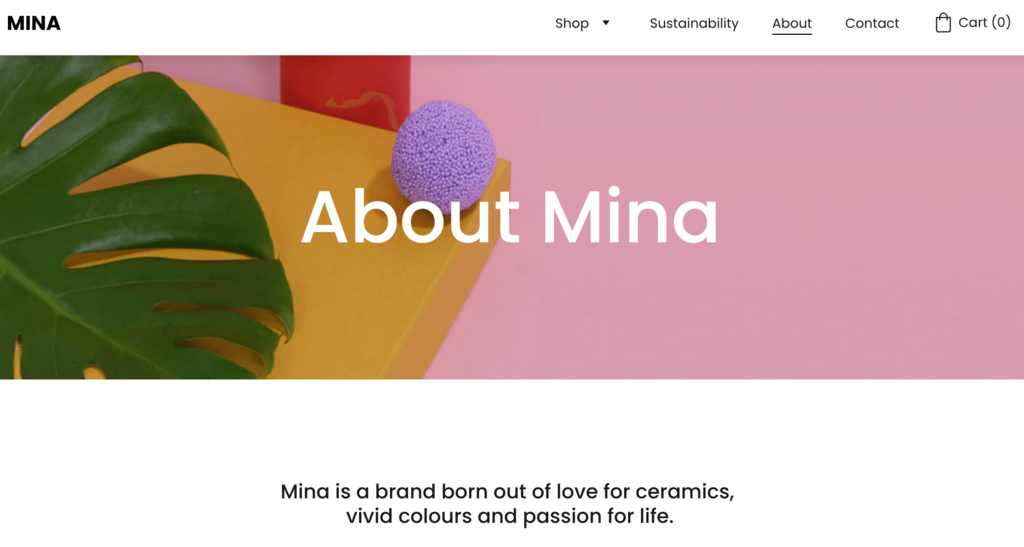
Type: online store
Standout feature: sticky menu, sustainability section feature
The About Me page of this template is a delightful blend of personal touch, brand narrative, and mission-driven content. The template emphasizes storytelling, giving businesses a platform to connect with their audience on a deeper level.
Key features:
- Narrative-centric layout – the page is designed to highlight brand values, journeys, and the mission statement.
- Founder’s section – a dedicated space to feature brand leaders and share their aspirations to boost relatability and build trust among potential customers.
- Unique Identity section – the page also features a dedicated section where personal brands can highlight their unique value proposition, be it sustainability, craftsmanship, or innovation.
- Elegant design – the page layout is a mix of typography, pastels, and images, ensuring captivating content delivery.
2. Poveda
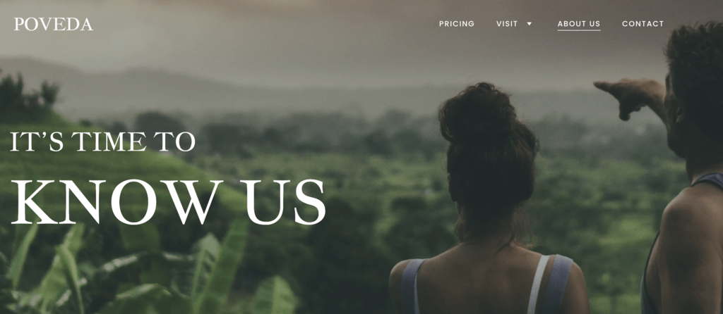
Type: travel booking site
Standout feature: sticky menu, testimonials section, social media feed
The About page of the Poveda template provides a versatile foundation for travel businesses aiming to convey their passions, adventures, and other unique offerings.
The layout seamlessly blends narrative elements, images, and distinct sections to help the business narrate its journey and vision.
Key features:
- Stunning visual imagery – the layout accommodates full-width images and gallery sections for showcasing stunning destinations, experiences, and customer testimonials.
- Dedicated Founder’s section – there’s a specially dedicated and customizable space for businesses to showcase their founders and core team.
- Social media integration – an intuitive Follow Us section connects with your brand’s social presence, fostering community and showcasing real-time experiences.
- Prompt for direct engagement – the Contact Us section is strategically positioned for inquiries to aid with lead generation.
- Elegantly crafted design – the mix of clear typography with adaptable color schemes delivers a user-friendly browsing experience.
3. Eugenie
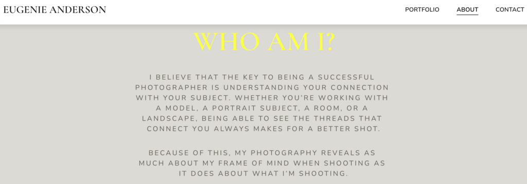
Type: photography site
Standout feature: minimalist design, focused content blocks
The Eugenie template features a minimalistic About Me page for photographers who want to narrate the philosophy behind their shots and establish a personal rapport with the audience.
Its layout follows a bare-bones approach that does not outshine the visual content and writing.
Key features:
- Personal philosophy highlights – a dedicated space allows photographers to illustrate their approach, belief system, and the distinctive lens through which they view the world.
- Visual content showcase – a section to feature work that underscores the photographer’s style and capability to prospective customers.
- Clientele list – a brief section listing notable clients to highlight the photographer’s industry experience.
- Direct engagement prompt – a strategic spot for a CTA that encourages visitors to get in touch and collaborate.
- Seamless integration with social media platforms – icons at the bottom of the page facilitate easy navigation to the photographer’s social media profiles.
- Uncluttered layout – its clean, minimalist design ensures that the photographer’s work and brand personality remain the focal points.
4. Proxima

Type: marketing agency website
Standout feature: minimalist design, one-page design, eye-catching CTAs
Proxima offers a unique About Me page layout designed to act like one expansive About page.
The layout is perfect for making a small business website, allowing potential clients to effortlessly understand their core values, services, and stated value propositions without complicated navigation.
Key features:
- Single-page narrative – Proxima helps users express their mission, vision, and services through concise storytelling on a single page.
- Effective lead generation – strategically placed CTAs across the page prompt visitors to reach out, explore services, or subscribe for updates.
- Visual showcase – the template offers a dedicated space for highlighting campaigns, success stories, and client testimonials to help build trust.
- Service highlights – a section providing a clear breakdown of the agency’s offerings helps visitors quickly find desired services.
- Team overview – a spotlight that highlights the agency’s key players and their expertise helps build a brand by fostering trust and connection.
- Sleek and minimalist aesthetics – the clean and uncluttered design ensures that the agency’s message and value propositions remain the focal points.
5. Thos
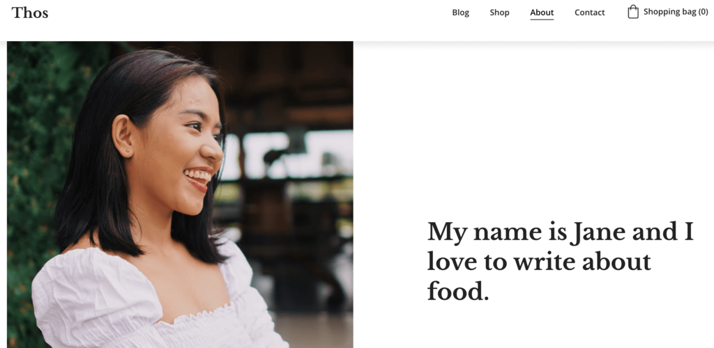
Type: blog site
Standout feature: simple layout, easy navigation, social media links
Thos offers a meticulously curated design tailored for bloggers who value simplicity and personal connection.
Whether it’s lifestyle, travel, hobbies, or any other niche, Thos ensures that the blog post remains the focal point.
As such, it makes sense for the template’s About Me page to center on presenting the individual behind the blog, featuring a minimal CTA section for newsletters and concluding with social media icons.
Key features:
- Versatile design – Thos’s minimalist design caters to various blog niches like fashion, travel, or tech.
- Engaging visuals – the layout ensures that the visuals enhance the storytelling process, regardless of the blog’s subject.
- Short and concise content display – Thos caters to the modern reader’s preference for brevity, promoting concise and engaging content presentation.
- Author introduction – its About Me page is tailored for blogs and presents the author concisely, maintaining the blog’s overall theme.
- Integrated social media links – conveniently positioned social media icons encourage sharing and community building, essential for growing a blog’s reach.
- Newsletter subscription – an unobtrusive subscription feature allows readers to stay updated with the latest posts, enhancing reader retention.
- Easy navigation – its simple layout ensures readers can effortlessly navigate through posts, enhancing the user experience.
6. Arnold
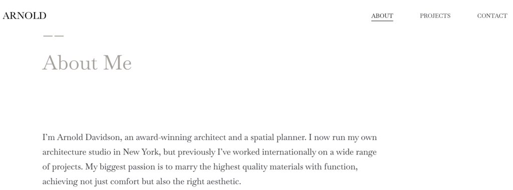
Type: resume site
Standout feature: bold hero section, modern design
This professional About Me template helps you attract the attention of potential employers through a creative resume.
Its About Me page serves as a dynamic digital CV designed to highlight educational qualifications comprehensively, showcase previous experiences, and even include client testimonials.
Key features:
- Optimized portfolio display – the page features a separate section that showcases the site owner’s projects, certifications, and significant achievements.
- Modern and minimalist design – the muted color palette and calculated use of white space deliver a clutter-free presentation, emphasizing content.
- Engaging typography – the applicant’s name, presented with striking typography, exudes authority and professionalism.
- Integrated testimonials – a section that helps provide credibility and validate the applicant’s skills and experience.
- Social media integration – easily accessible icons connect users to their professional social media accounts, facilitating broader networking opportunities.
- Contact information section – an essential for any resume site, ensuring potential employers or collaborators can quickly reach out to you.
- Easy navigation – the streamlined navigation bar ensures visitors can access the needed sections hassle-free.
7. Dossenbach
Type: freelancer portfolio site
Standout feature: bold hero section, modern design, sticky menu bar
Built on the principles of personal branding, this portfolio About Me template is tailored explicitly for freelancers.
This template’s dynamic, contemporary design offers an engaging user experience by marrying functionality with aesthetics.
Key features:
- Dynamic project showcase – a designated section to spotlight individual projects, case studies, or standout assignments.
- Streamlined design – the clean lines combined with a touch of flair ensure the site remains professional and approachable.
- Bold typography – the freelancer’s name and key services are spotlighted with distinct fonts, signifying expertise and capturing attention.
- Client reviews – strategically placed testimonials vouch for the freelancer’s proficiency, adding layers of trust for prospective clients.
- Direct contact options – designed with user convenience in mind, this section allows clients to initiate conversations, bookings, or inquiries swiftly.
- Intuitive navigation – a well-organized menu ensures users can effortlessly browse the site, locating information easily.
8. Ayomide
Type: single-page event site
Standout feature: bold hero section, art-heavy design, sticky menu bar
This template is crafted for adaptability and offers a creative About Me page that serves as an optimal solution for event organizers.
The flexible layout of the entire page presents seamless marketing opportunities for diverse events, helping to keep the site modern and relevant.
Key features:
- Captivating hero section – designed to immediately grab visitors’ attention and set the tone for an event.
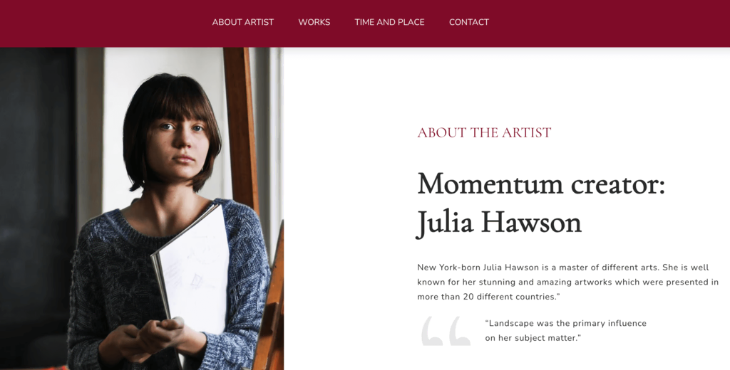
- Informative About the Exhibition segment – delivers insights into the exhibition’s theme.
- Dedicated About Artist tab – gives visitors a concise overview of an artist, shedding light on their background, artistic vision, and inspirations.
- Artwork showcase – displays select pieces encapsulating the exhibition’s theme, offering visitors a preview of what awaits them.
- Concise navigation – with easily accessible tabs from the sticky menu, visitors can navigate the platform effortlessly.
- Harmonious design – every design element, from typography to whitespace, enhances displayed artworks for a memorable viewing experience.
9. Zaragoza
Type: single-page business site
Standout feature: landing-page style hero section, simple design
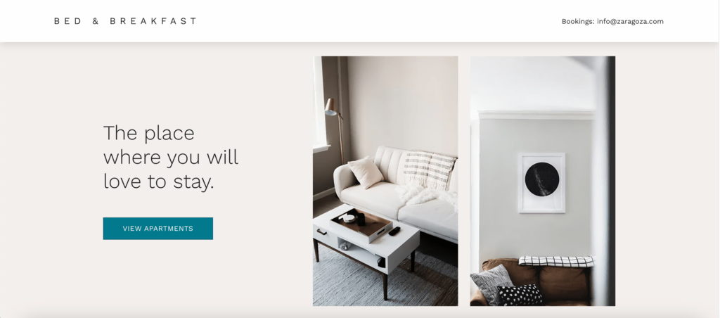
Zaragoza is an elegant single-page business site template best suited for hospitality ventures. Its straightforward hero section immediately captivates visitors by highlighting the essence of the stay experience.
The template acts as an entire About Me page that focuses on showcasing your business name and offerings.
Key features:
- Image-rich layout – the design prominently showcases high-quality images in a grid layout to grab attention.
- About section – a dedicated About section provides detailed information about the business or service.
- Amenities listing – a straightforward and organized listing section that can be adapted to showcase the business’s features, amenities, or services.
- Testimonials section – dedicated space to showcase user or customer reviews, which can help build credibility and trust with the visitors.
- Footer with essential details – the bottom of the template contains crucial information such as the location, contact details, and links to social media channels.
- Straightforward navigation – the single-page design ensures users can quickly find the information they need without unnecessary clicks
10. Tixly
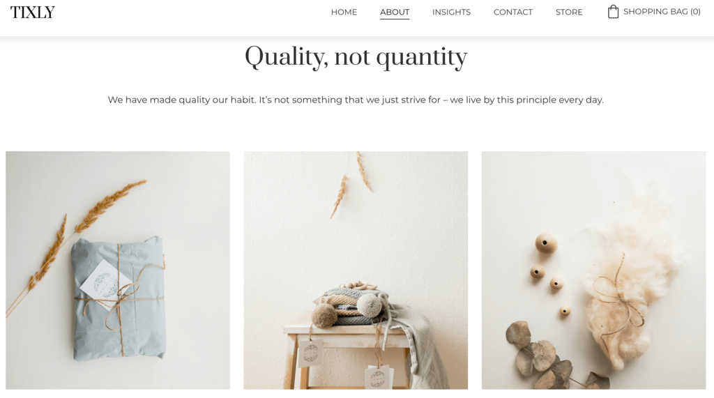
Type: eCommerce site
Standout feature: landing-page style hero section, sticky menu bar
Streamlined for UX and brand authenticity, the Tixly eCommerce template blends design finesse and functionality.
Specially curated for online retailers, its minimalist About Me page layout allows brands to share their narrative in a minimalist yet impactful manner.
Key features:
- Engaging hero section – the minimalist hero section immediately captures attention, setting the tone for a brand’s narrative and offerings.
- User-friendly navigation – the sticky menu bar ensures effortless navigation, making it easier for visitors to explore the site without disruptions.
- Simple About Me page design – highlighting the brand’s story, this feature integrates simple and minimalist designs, ensuring content remains at the forefront.
- Uncomplicated user experience – a clutter-free design prioritizes a seamless shopping journey for visitors, from browsing to checkout.
- Authentic brand storytelling – the simple About Me design ensures brands can effectively communicate their philosophy and values, resonating with their audience.
- Seamless shopping journey – intuitive product listings and checkout processes make online shopping a delightful experience for customers.
How to Make an About Me Page With Hostinger Website Builder
Hostinger Website Builder simplifies the process of creating a responsive, mobile-friendly site, requiring no coding or design expertise. You can easily customize one of the pre-designed templates listed to create a web page that suits your needs.
You can start building your site once you’ve selected the Hostinger Website Builder platform, bought your domain name, and linked it to your website.
Our all-in-one builder package includes hosting for your site and a free domain name for 12-month plans and above. You can claim and register your free domain through your Hostinger account.

Now, let’s look at the steps to use the website builder to understand how to make your website and the About Me page:
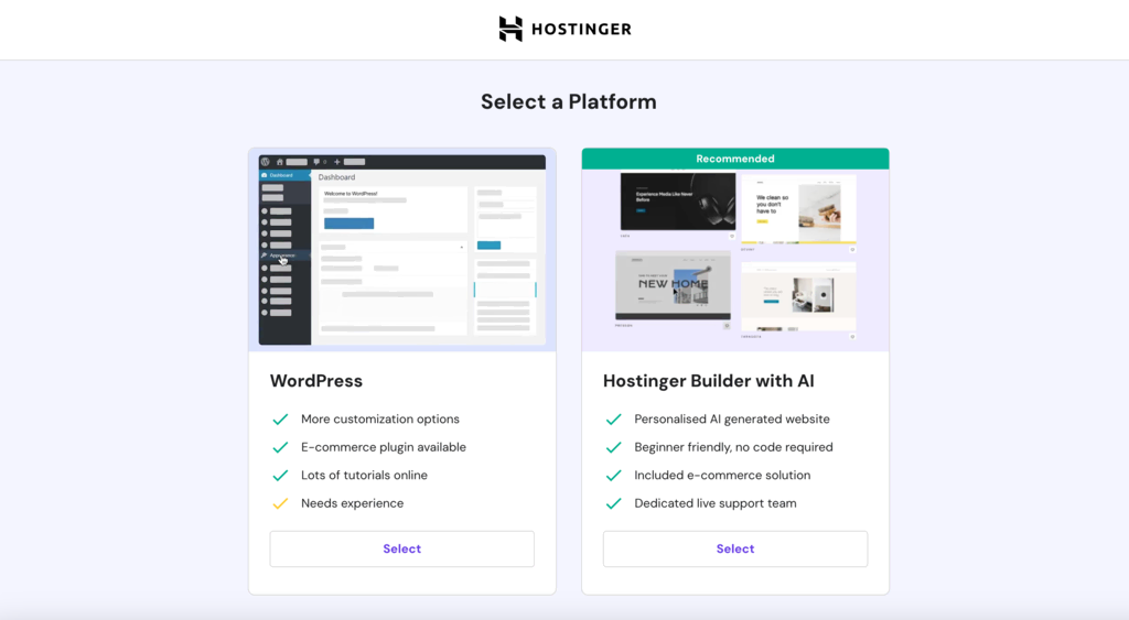
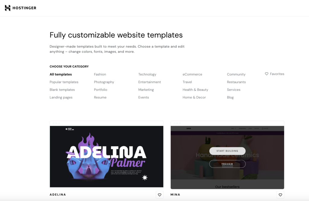
1. Choose a Template
After selecting the Hostinger Website Builder platform and connecting your site to the domain, you’ll be redirected to the website template library.
Choose a template from our recommendations and click Start Building.
2. Customize the Template
Next, click the Website styles icon on the left side menu to customize the selected template’s Colors, Text, Buttons, and Animations. Remember that these changes will be applied across the site.
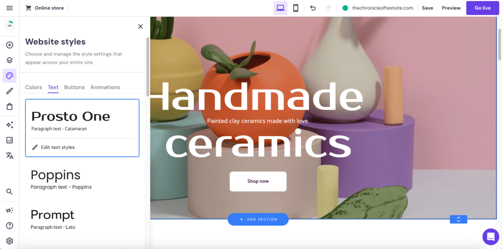
You can use the drag-and-drop editor to change the page layout. Just click on an element and move it to a new area.
To test the site’s responsiveness, click on the mobile icon at the top of the window.
Click on Preview to test out the customizations you’ve made to your site. If you’d like to work on another template, just go back to the library and choose a different one.
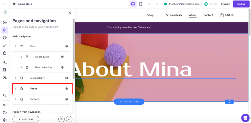
3. Design Your About Me Page
To start working on your About Me page, click on the Pages and navigation icon on the left side menu and select the About page.
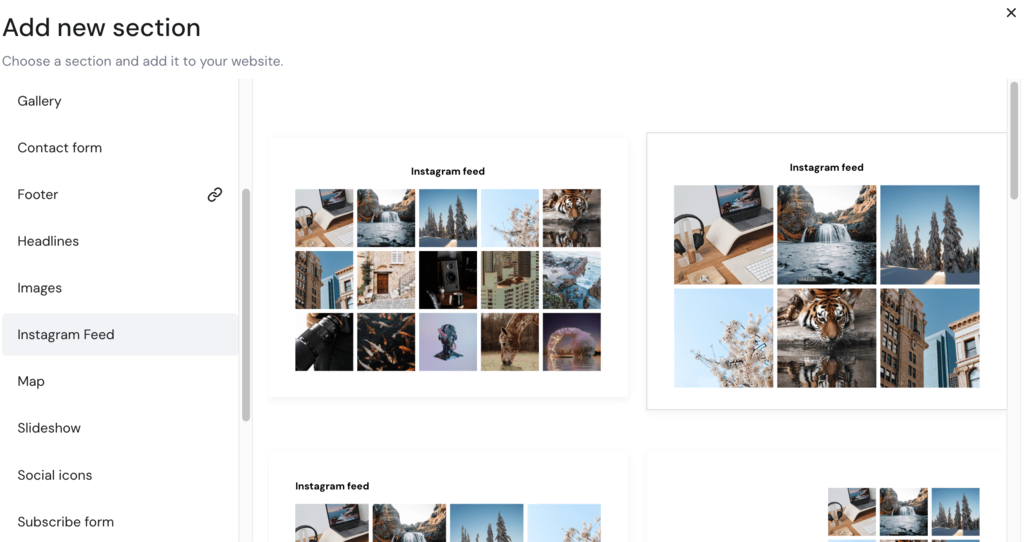
Use the drag-and-drop feature to customize the layout further. You can also add new sections to the page by clicking on Add Section and selecting from a variety of options, including Instagram Feed, Map, and Testimonials, among others.
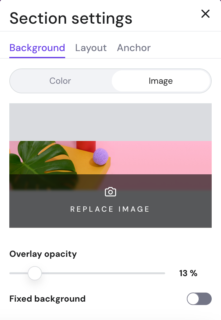
To edit a specific page section, click on it and select Edit section to open the Section settings.
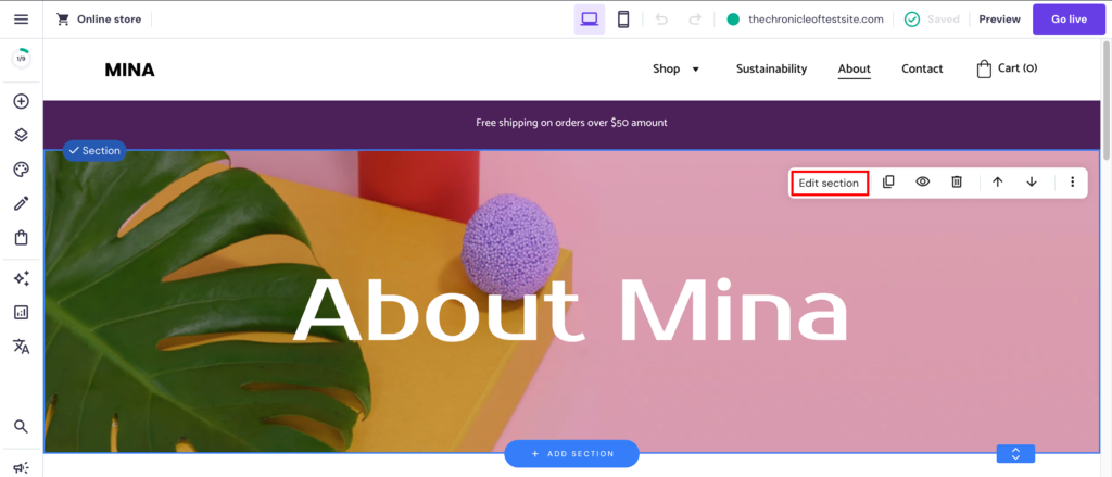
Section settings allow you to customize each section’s background, layout, and anchor.
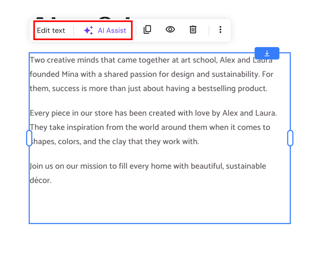
To edit the pre-existing text content on the page, simply select the block and click Edit text. Alternatively, click the AI Assist button to have your content written by Hostinger’s AI-based Content Writer.
Suggested Reading
Still unsure about what platform to use about your About Me page and businesses website? Check out these guides that talk about factors to consider and platform comparisons:
Factors to Consider Before Choosing a Web Host
Website Builder vs Custom Website
Best Web Hosting for Small Business Websites
Conclusion
About Me pages are vital to conveying your personal or professional story effectively. Whether you aim to connect personally as a blogger or make a striking, professional impression, the right template can make all the difference.
Investing time in choosing and customizing an about me page for your site can significantly elevate your online presence, turning visitors into followers, clients, or future employers.
Here are some of the key elements that make an About Me page effective:
- Brand story – sharing previous experiences or stories that shaped who you are today makes you relatable.
- Visuals – high-quality images or graphics can make your page more engaging and help convey your brand’s personality.
- Clear communication – clearly conveying your identity, profession, purpose, and brand values is crucial for connecting with visitors.
- Call to action – a clear CTA, inviting the reader to connect, check out your work, or subscribe, adds a goal to your page.
- Founders and our team section – introducing the faces behind the brand, especially with professional headshots, adds credibility and a personal touch.
Page templates can help you get started, but your personal touches, authenticity, and stories will make all the difference. Share your website builder template picks with us in the comments below.

Akshay is a Senior Content Writer who loves writing about technology. As a Computer Engineering graduate and a certified digital marketer, he aims to make tech easier for everyone. He also enjoys cooking, traveling, and learning new languages. Follow him on LinkedIn