The 30 Best Website Color Schemes to Make Your Website More Compelling
Choosing the right color scheme is important when building a website. Other than representing your brand, a nice color scheme can make visitors stay longer on your website.
Since there are so many website color schemes, choosing the right one can be challenging. This article will provide 30 inspiring website color schemes, including their names and hex codes.
But before getting into the list, we will explain why choosing the right color scheme is one of the most crucial parts of your website creation.
Download Website Launch Checklist
Why Are Website Color Schemes Important
Although colors are often regarded for aesthetic purposes only, picking the right palette brings additional benefits to your site. Here are three reasons why website color schemes are essential:
Boost Conversions
Adjusting your website color scheme can boost the conversion rate. A conversion happens when a visitor performs a desired action on your website, such as purchasing a product or filling out a subscription form.
Picking the right website color scheme can influence your visitors’ decisions. If important elements like call-to-actions (CTAs) stand out, visitors are more likely to interact with them.
A CTA is a part of a website that compels visitors to perform an action leading toward a conversion. It can be text, image, or button.
A study shows that red works better for a CTA button than green. Red contrasts the website color scheme more than green, allowing visitors to distinguish the CTA easier.
Additionally, red evokes energetic, speedy, and passionate emotions according to color psychology. Therefore, red CTAs create a sense of urgency and entice interactions.
Establish Brand Identity
Your website color scheme should reflect your brand personality. For instance, bright color schemes suit a brand with an energetic, fun, and youthful character.
Using a unique color palette helps your brand stand out from competitors. If your website’s color scheme is similar to others, it can confuse customers.
Since people often associate a brand with a certain color, keeping your website’s color scheme consistent helps improve brand recognition.
For a business, website color schemes also help establish customer relationships by eliciting the right emotions. Emotionally connecting with customers increases brand loyalty, bringing benefits to your business.
Expert Tip
When designing a website, you must treat the project or brand as a whole unit. The designer must first evaluate the target audience and understand where the brand stands visually. And to prevent future mistakes, you should consider how the color choice will affect the brand’s development in the future.

Retain Visitors
For a web designer, knowing the right website color schemes can improve user experience, keeping the website audience longer.
Combined with a well-designed user interface, colors help visitors navigate your site. For example, distinct colors let users quickly find navigation elements. They also allow you to visually separate website contents based on their importance.
Since visitors usually ignore most website content, visual hierarchy draws users’ attention to the more important content first.
On the contrary, randomly choosing website color palettes may interfere with usability. For example, having black text on a dark background worsens readability.

Top 30 Website Color Schemes
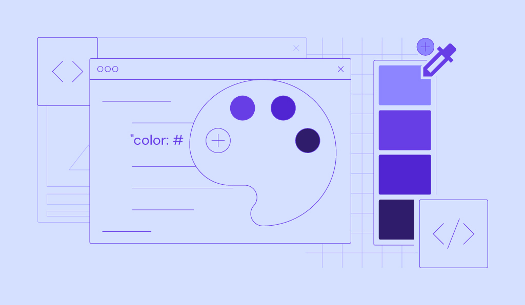
To inspire you, we will list the top 30 website color schemes. We will also use the color picker tool to acquire the colors’ names and hex codes.
With the following information, you will be able to mix and match the colors and create your own website color scheme.
1. White and Black

To emphasize important content, consider using a black and white color scheme. This two-color combination makes your website look modern and minimalistic.
An example of a website with a monochromatic color scheme is Savas Ozay’s online portfolio.
The artist keeps his website color palette simple, using a white background and black as an accent for text. The dominant white space lets visitors immediately focus on the art piece. Otherwise, their attention will shift to the colorful background instead.
The minimalist web design shows that the visual artist wants the site to echo his art style and highlight his work.
Colors used: White (#FFFFF), black (#1D1D1)
2. Dark Green, Ivory, and Yellow

Use a website color scheme that helps deliver your brand’s voice. For instance, earthy tones are suitable for websites with environmental messages.
Mandai’s website is an excellent example of using earthy colors to establish the brand as an eco-conscious entity.
The wildlife eco park’s website color scheme consists of dark green, ivory, and yellow. These colors are often associated with the earth, hence the natural connotation.
This color palette is easy on the eyes, making the website seem relaxing and organic.
Colors used: Green (#009B4D), tangerine yellow (#FFCC00), ivory (#FAF5E9)
3. Bright Green and Hot Pink

Bright colors make your website energetic and cheerful. They stimulate the brain and evoke strong emotions.
With pink hues and bright green, 3 Sided Cube creates a lively site that aligns with its fun and passionate company values.
To contrast the vibrant colors, the app development company uses white and black as accent colors. It also incorporates different bright shades of pink and green, adding more depth to the website.
This bright color palette is effective for grabbing the visitors’ attention. This color combination is also uncommon for a tech company, making the 3 Sided Cube website stand out from others.
Colors used: Malachite green (#31EC56), razzmatazz (#EF036C), heliotrope (#EE72F8)
4. Dark Grey and Yellow-Green

Vibrant colors emphasize important information, especially when integrated into a muted website color scheme. An example of a website using this vibrant-muted color combination is GolfSpace.
GolfSpace’s website uses a monotone color palette – mostly darker grey shades. It uses yellow-green or chartreuse to highlight essential elements such as buttons, prices, and offers. Against the website’s grey background, yellow-green can easily catch the eye.
Using yellow-green allows visitors to see CTAs better, resulting in better conversions. In addition, the color evokes an energetic emotion, making it suitable for a sport-related website.
Expert Tip
The easiest way to choose a CTA color is to look at the opposite side of the dominant color palette and select one from there. Additionally, the contrast between the background and the CTA button plays a crucial role. Therefore, every designer should abide by WCAG 2.0 and APCA guidelines since every palette may give different results depending on its use.
Colors used: Yellow-green (#BAFF39), dim grey (#6E6E6E), white (#FFFFFF)
5. Blue Shades and White

Blue conveys stability and reliability, making it popular for tech companies’ websites, including Drone.io. This software testing automation company’s website color scheme uses blue and white.
It uses a very light blue with a white gradient as the background. As for the text and CTA buttons, the website uses regal blue and brighter blue, respectively.
Despite using similar colors, these different blue shades make it easy to distinguish essential elements from the light blue background.
Colors used: Light blue (#E9F1FA), bright blue (#00ABE4), white (#FFFFFF)
6. White and Lime Green

Green is perfect for an eco-friendly website company, such as Lime. The company’s website color scheme consists of only green and white.
Using only two colors keeps the website minimalistic and neat. In addition, using green against the neutral background ensures all vital information is visible.
For Lime, using lime green makes for consistent branding. The electric vehicle startup also uses an image with green and earthy tones that reflects the website’s color palette. A background image is a great way to make your website more compelling.
Color used: Lime (#00DD00), white (#FFFFFF)
7. Beige and Dark Grey

Consider using neutral colors such as beige for a calming and minimalistic website. Beige goes well with many colors. It can look either warm or cool, depending on the combination.
Beige is also neutral and easy on the eyes, making it ideal for a website’s background. Using it with a contrasting accent color will make foreground elements easily distinguishable.
The eCommerce site Wells is a great inspiration for a beige website color scheme. It pairs beige with dark grey, creating a muted palette that goes well with the simple web design.
Colors used: Beige (#DDD0C8), dark grey (#323232)
8. Black and Neon Blue

Blue is suitable for a futuristic and high-tech-themed website, given its association with modern technology.
Neuro Symbolic Lab’s website color palette consists of neon blue and a primarily black background. This color combination makes the blue stand out, emphasizing the website’s futuristic theme.
The simple color combination also simplifies the busy web design. Using more colors would complicate the website and distract visitors.
The website also uses white text to complement the dark surroundings and improve readability and user experience.
Colors used: Neon blue (#2272FF), black (#1D1D1)
9. Orange Shades and Blue

For a unique website color scheme, consider A Short Journey’s orange and blue color palette.
This website uses different shades of orange for the background. This primary color gives the website more depth, matching the three-dimensional web design.
The orange shade is commonly associated with happiness and enthusiasm. It’s perfect for this website, which encourages visitors to go on a holiday.
The foreground objects mainly use blue and white. This contrasting color allows the visitors to focus on the website’s interactable elements.
Colors used: Orange (#F9B872, #FAE7A5), powder blue (#B6E1E7)
10. Pale Pink and Navy Blue

Some websites offer products, services, or content for a specific gender. These websites may use a particular color scheme as a hint.
The color schemes for websites geared toward women usually contain pink, given its association with femininity.
An example of a pink website is Oui by Jean Dousset. This eCommerce website sells diamond jewelry designed for women, hence the pink-dominant color palette.
The website uses different shades of pink to separate sections. To add more dynamic, it uses navy blue as the supplementary color.
Colors used: Cavern Pink (#E1B0AC), light pink (#F2D4D6), navy blue (#213F99)
11. Pastel Purple and Neutral Accents

To make other elements stand out, keep the website’s background simple. For example, the Empathy Experiment website uses a light pastel purple gradient background. Gradient colors make your website background compelling yet simple.
The unsaturated background contrasts the 3D-animated objects’ vibrant colors, making the latter stand out.
For texts and buttons, it uses the neutral colors white and black. Contrasting colors help visitors distinguish important information and maintain focus.
Colors used: Pastel purple (#C5ADC5), light steel blue (#B2B5E0)
12. Navy Blue and Electric Blue

Blue is commonly regarded as the color of trust, making it a popular choice for business website color schemes. Finlor’s website is an excellent inspiration for a blue color scheme.
Finlor’s website color palette is primarily blue. Navy blue dominates the website’s background, with electric blue and white as complementary colors.
Different shades of blue allow the logistics company to present itself as trustworthy. The lighter secondary colors improve texts and CTA elements’ visibility, resulting in a better user experience.
Colors used: Deep navy blue (#01257D), electric blue (#00FFFF)
13. Color Gradient, White, and Dark Blue

If you want to add colors to your website, consider using a color gradient. With gradients, you can experiment with color schemes without making your website overbearing.
A website that uses color gradient well is Stripe. Half of its homepage’s background is a dynamic color gradient, while the other half is simply white.
It uses white for elements over the colorful background, including the navigation menu and illustrations. As for the text, it uses white and very dark blue to ensure readability.
Combining gradients and neutral colors makes the website vivid yet clean.
Colors used: White lilac (#F8F8F9), dark blue (#111439), color gradient
14. Beige, Orange, and White Accent

Hi, skin knows how to make its brand memorable using the right color combination.
The company’s website color scheme mainly consists of shades of beige, with orange and white as supplementary colors. These warm colors are reminiscent of human skin, perfect for the skincare eCommerce site.
Hi, skin only uses orange for important elements. Pairing an attention-grabbing color like orange with neutral colors makes the CTAs more enticing.
To achieve better readability, it uses white for text to contrast both beige and orange.
Colors used: Beige (#CD9C8A), orange (#FF5100), white (#FFFFFF)
15. White and Blue-Grey

Blue evokes the feeling of serenity, perfect for Blue Lagoon’s website. This website features the company’s relaxing hotel experience.
The hot spring resort’s website color scheme uses delicate shades of blue-grey and white, reminiscent of hot spring water and vapor.
Blue-grey works best for a tranquil color palette compared to other blue tones as it is less vibrant. Pairing the white background with blue-grey results in a minimalistic site with an understated look.
As for the text and buttons, Blue Lagoon uses grey and dark teal. Despite using muted colors, the CTAs still stand out thanks to the white space.
Colors used: Blue-grey (#96C2DB, #E5EDF1), white (#FFFFF)
16. Bright Red and White

Some website color schemes work well to emphasize the website’s layout, such as two-tone colors for a two-column web design.
As the Best Horror Scenes website demonstrates, bright red and white can accentuate its two-column website layout. Using contrasting colors side-by-side can help separate the website’s content visually. In addition, pairing red with a neutral color like white makes the former appear more striking.
What makes Best Horror Scenes unique is its uncommon red and white color palette. This color combination is different from other black-and-red horror website color schemes.
Colors used: White smoke (#F0F0F0), bright red (#E7473C)
17. Classic Blue, Turquoise, and Gold

As Slumber shows, a dark color palette is excellent for a peaceful-looking website.
Slumber uses darker classic blue to emulate the night sky. This darker blue evokes a cozy and calm feeling, matching its “the app that puts you to sleep” slogan.
The audio library application avoids vivid colors to preserve the website’s serene mood. Instead, it opts for dark turquoise and gold for the accent colors.
Although turquoise and gold aren’t vibrant, these colors remain visible on top of the dark blue background. This way, visitors can still read the text and navigate the website easily.
Colors used: Dark classic blue (#0A1828), turquoise (#178582), gold (#BFA181)
18. Yellow and Blue

Yellow is the color of optimism, creativity, and intellect – a suitable option for a business website.
However, web designers may want to avoid bright yellow as the primary color. Bright yellow can quickly grab visitors’ attention and overpower other colors.
If you plan to use yellow, consider using Banky’s website color scheme as inspiration. The banking service company uses yellow as its background and blue as the complementary color.
Blue is the opposite of yellow on the color wheel, allowing the former to stand out when used together. Using blue as the accent color increases CTAs’ visibility against the vibrant surroundings.
Colors used: Yellow (#FFCE32), Prussian blue (#1D63FF)
19. Dark Royal Blue and Gold

Sotheby’s website color scheme is an excellent option for a website that aims to look professional and poised. The website mainly uses a dark royal blue shade with white and gold accent colors.
Royal blue is an elegant color due to its history with the British monarchy. Meanwhile, gold symbolizes prestige, wealth, and success – perfect for this luxury real estate company’s website.
When paired, the dark royal blue and gold combination creates a classy and neat website. This website color scheme also helps the company establish its reputation with visitors.
Colors used: Blue (#002349), gold (#957C3D)
20. Blue, Beige, and Coral Red

Combining three colors can be tricky because some colors likely clash. But when done well, the result can be surprisingly pleasant.
Dollar Shave Club is a website that does three-color combinations well. The personal grooming company’s website color schemes center around coral red and beige. Although coral red and beige commonly pair with neutral colors, Dollar Shave Club opts for blue instead.
The personal grooming company uses deep blue as the website’s primary color to contrast beige and coral red, allowing important elements to be more noticeable.
Blue is also ideal for this website, which mainly sells men’s grooming products. Men may prefer blue since the color is commonly associated with masculinity.
Colors used: Deep blue (#001233), light coral red (#FF595A), beige (#CAC0B3)
21. Red and Yellow

A lively color scheme is suitable for a playful website. As Make Us Care shows on its homepage, combining red and yellow creates a fun and bold website.
Yellow symbolizes happiness, while red evokes strong emotions, including passion and strength. While both red and yellow are strong colors, they go well together.
Pairing unique typography with white makes the text easily readable against the striking background.
Colors used: Coral Red (#FE3A4A), golden poppy (#FEC501)
22. White and Purple

Adding one color is a great way to make a white-dominant website more attractive.
Liberty London’s website color scheme uses purple as an accent for an otherwise monochrome palette. As a regal color, purple suits the luxury eCommerce website’s overall theme.
Using only purple for essential elements makes the website minimalistic. Dominating the rest of the website with neutral colors such as white and black allows purple to remain prominent.
This website color scheme increases the homepage’s impact on visitors, driving more conversion.
Colors used: Tyrian purple (#4F0341), white (#FFFFFF)
23. Beige and Red

Due to color trends, some shades are strongly associated with a specific era. If you are after a 90s theme, consider Pertinens’ website color palette for inspiration.
The website uses beige as the primary color and red as the accent. Using red on a mostly bare website allows the bright color to catch visitors’ attention easily.
Beige evokes a strong retro feeling since many old-school electronics are in that color. In addition, bright hot red was a popular color in the 90s.
To make the website more interesting, Pertinens added a 90s office illustration. It is a smart way to decorate a website while keeping the theme and color scheme consistent.
Colors used: Light beige (#FDF8F0), crimson (#F0122D)
24. Blue Shades, White, and Red-Violet

Using a bold feature color can make your website overbearing. To achieve visual balance, pair a bright accent color with a desaturated color palette.
For example, sourcing company Imprint Genius’s website uses bright blue and red-violet as accent colors. It uses pale blue as the background color to provide a stark contrast. The contrasting colors add more depth to the isometric web design.
Using bright tones against a pale blue background also helps the illustration stand out. Despite being subtle, red-violet stands out thanks to the primarily cool color palette.
This color palette makes the homepage look light but eye-catching.
Colors used: Pale blue (#EFFAFD), royal blue (#4A8BDF), eggplant (#A0006D)
25. Teal and White

If you can’t decide between blue and green, go for teal instead. Teal has the two colors’ properties, making it ideal for an eco-friendly tech company such as Prinoth.
Prinoth’s clean motion website color scheme consists of teal and white. Teal gives off a sophisticated and knowledgeable impression, matching this website that features zero-emission innovation.
Although both the background and foreground objects are teal, the different shades make them distinguishable. The deep teal background allows the foreground elements in lighter colors to stand out. Using light teal and white makes the CTAs and text more visible.
Overall, this minimal website color scheme is perfect for a tidy and modern website.
Colors used: Cardin Green (#0C1A1A), downy teal (#6ACFC7)
26. Light and Reddish Orange

As CIRCUS inc. demonstrates, sometimes you may only need one color for your website. The marketing company uses reddish and light orange for its Chinese website.
The hue difference allows the orange shades to look distinct despite being the same color. This combination also resembles the Chinese flag, keeping the website theme consistent.
Using two bright colors together makes the website looks lively and bold. As for the accent colors, the company simply opts for black and white to contrast the bright background. These neutral colors are not distracting and help retain the website’s warm tone.
Colors used: Orange (#FFAB00), Harley Davidson Orange (#DD2E18)
27. White, Purple, and Orange

The flat website design has become popular among companies lately. This design type suits a professional but casual website. However, choosing flat website color schemes may be difficult due to design restrictions.
Flat websites are usually minimal, with bright colors against neutral backgrounds. They typically exclude any shades or tints.
If you are after the flat web design aesthetic, look at Mila’s site. The French real estate company’s website color scheme only contains three colors – white, purple, and orange.
Purple and orange match this flat website, giving it more vibrance. Using purple for CTAs for a mostly simple website effectively grabs the visitors’ attention.
Colors used: White (#FFFFFF), sunset orange (#FF5841), red-violet (#C53678)
28. Yellow, Brown, and Purple

If you are looking for unique website color schemes, consider Kelsey Dake’s portfolio website color palette. The illustrator dares to combine different bright colors, making the website fun and lively.
The website color scheme consists of brown and yellow. Brown is a relaxing color, making it a great option to contrast more aggressive colors like yellow.
The artist also features two purple illustrations on its homepage for variety. Purple works best with yellow because these colors are on opposite sides of the color wheel.
Colors used: Sunglow yellow (#FFD43A), baker’s chocolate (#582C12), medium orchid purple (#D668E3)
29. Deep Purple, Orange, Red, and Pink

Using too many bold colors can make a website too flashy. However, Inside the Head’s website remain understated with four primary colors – deep purple, orange, red, and pink.
Interestingly, this website’s primary colors vary depending on the page. As for the landing page, it uses all colors almost evenly.
Inside the Head has a simple layout and design, allowing for complicated website color schemes. Using many bright colors can complicate the website, diverting visitors’ attention from the website’s content.
Using white for text and navigation buttons also preserves the site’s usability. It is vital for a website that relies on user navigation to present information.
Colors used: Deep red (#8E0D3C), blackcurrant #1D1842), orange (#EF3B33), rose pink (#FDA1A2)
30. Brown and Beige

Flooring company Engineered Floors uses a brown and beige combination for its website color scheme. Both brown and beige are natural colors that give an organic and relaxing feeling.
Beige is a neutral color, but brown gives the former warmth when paired together. This combination results in a cozy and homey color palette.
This color scheme also adds more value to the homepage. Website visitors can learn the company’s brand tone through website colors.
Additionally, the website uses deep grey for texts and icons to ease user navigation.
Colors used: Narvik (#EAE7DD), Sorrell brown (#99775C)

Conclusion
Website color schemes are essential in website design. The right color combinations make your website aesthetically pleasing and offer other benefits.
We have provided 30 website color schemes for your inspiration. However, it’s up to you to choose the right one for your site. Be sure that the color scheme you pick align with your brand identity.
Remember, your website should also perform well to provide the best user experience. Use a reliable hosting service to ensure your website is always fast and accessible.
Learn More About Website Design
10 Best Website Design Inspiration
Web Design Best Practices to Attract More Website Visitors
How to Make a Website Mobile-Friendly
Website Usability Testing
Website Color Schemes FAQ
This section will answer common questions about website color schemes. If you still have questions, don’t hesitate to leave a comment below.
How Many Color Schemes Should a Website Have?
Ideally, a website should only have one color scheme comprising up to four colors. Using too many colors can make your website appear complicated.
We recommend using three colors to abide by the 60-30-10 design rule. Use 60% of the dominant color, 30% of the secondary color, and 10% of the accent color to make your website look balanced.
How to Find Exact Color Schemes on a Website?
To extract color from a screenshot, use Dopley. This website provides detailed information about the color, including its value, combinations, and varying shades. To extract color using a website URL, use Alwane.io. However, unlike the previous site, this web-based tool provides less color information.

Aris is a Content Writer specializing in Linux and WordPress development. He has a passion for networking, front-end web development, and server administration. By combining his IT and writing experience, Aris creates content that helps people easily understand complex technical topics to start their online journey. Follow him on LinkedIn.