15+ Best Teacher Website Examples for Online Courses, Offline Services, and More
Creating a website is essential for advancing your career. It lets you connect with fellow teachers and prospective students, share your thoughts, and provide online learning opportunities.
Various resources and technologies are available to ease the process of building a website. Therefore, you can even make one independently if you’re willing to spend time learning and experimenting.
Whether you want to build a teacher website yourself or hire a professional, we have listed 15 best examples to inspire you. We have divided them into five categories, including offline services and portfolios.
Our experts have analyzed the teacher websites according to several factors to make the list:
- User-friendliness – the website’s navigation and ease of use.
- Web design – the website’s appearance and style, visual content, font, graphic design, and color palette.
- Responsiveness – the website’s interface in different screen sizes, like a computer or mobile device.
Download Website Launch Checklist
Top Website Examples for Online Courses
If you want to sell courses online, here are some examples of online teacher websites to check out.
1. Dr. Deb Therapy

Key Features: transparent pricing and customer reviews
Dr. Deb is a highly-experienced educator, licensed psychotherapist, and holistic mental health expert based in New York City. Her WordPress site is one of the best teacher websites, featuring a full-width image, course offers, and client reviews.
On the home page, you can see a general overview of what Dr. Deb’s classes offer. As you scroll down, two buttons display the class categories – for students and professionals.
She has also featured classes along with the teaching curriculum explanation and price. There’s a CTA at the bottom of each section so that people can quickly enroll if they see fit.

To top it all, this teacher website applies an eCommerce feature that makes checkout easier without redirecting visitors to another page.

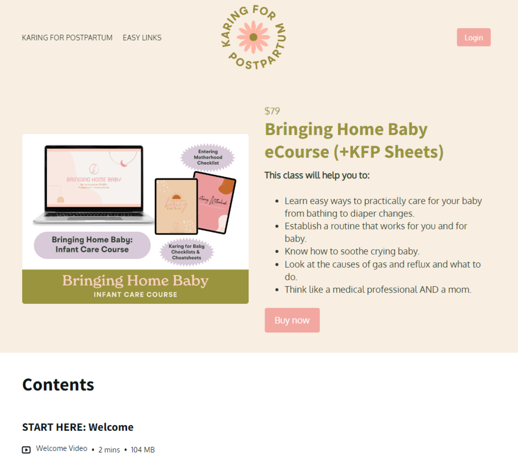
2. Karing for Postpartum

Key Features: attractive design elements and seamless navigation
Karrie Locher is a postpartum and neonatal nurse and certified lactation counselor. Karing for Postpartum is one of the best teacher websites with a colorful layout, creative elements, and smooth navigation, making it attractive for visitors.
On top of that, Karrie uses her copywriting skills to create engaging copy along with CTA buttons for her on-demand classes, which improves customer engagement and boosts clicks. The color palette used on this website also matches the website’s niche and topic.
In contrast with Dr. Deb Therapy website, this teacher website requires a member login to complete purchases. While it takes more time for the checkout process, this approach can help you with customer relationship management.
3. Angela Valencia Spanish Teacher
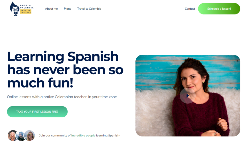
Key Features: clean design and a pop-up widget
Angela Valencia is an experienced Spanish teacher whose website features a minimalistic web design, mainly using white and various green shades.
Its homepage includes an encouraging message for visitors, accompanied by a CTA button and pop-up widget offering a free learning session to attract more customers. This teacher website also displays transparent pricing, which lets potential students know how much each class will cost before signing up.
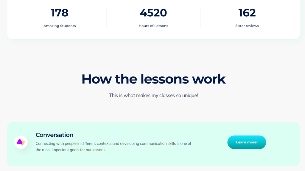
As you scroll down, Angela showcases her teaching credibility through metrics that track the number of students, hours of lessons, and five stars reviews given. Then, she describes how her education methodology differs from similar language courses online, displaying her value proposition to prospective students.
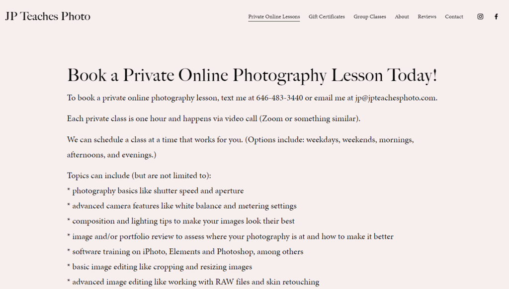
4. JP Teaches Photo
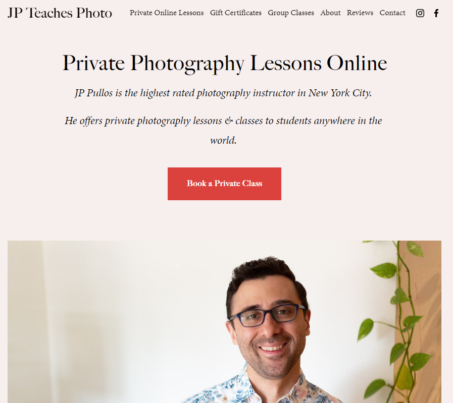
Key Features: customer reviews and booking feature
JP Pullos is a highly recognized photographer in New York City. Simple yet effective web design is one of the many factors that drive his business to succeed. This teacher website begins with a title, text, and call-to-action (CTA) button, enabling JP to directly offer his private class to visitors, thus boosting sales.
JP Pullos will create an online course specifically tailored for any aspiring photographer seeking to master the trade. There, potential clients can find the lesson details and his contact details.
This experienced photography teacher uses a more personal approach to his website copywriting. At the same time, he shows his credibility in the relevant domain through storytelling.
Incorporating images to complement the written content is a smart way to display portfolios, just like JP Pullos does on his website.
Suggested Reading
30+ Most Successful Website Ideas to Make Money
How to Build an eLearning Site in 5 Steps + Tips for Growth
Top Teacher Website Examples for Offline Services
Here are four examples for those looking to learn how to design a website for a business selling offline education services.
1. Glaze & Phase
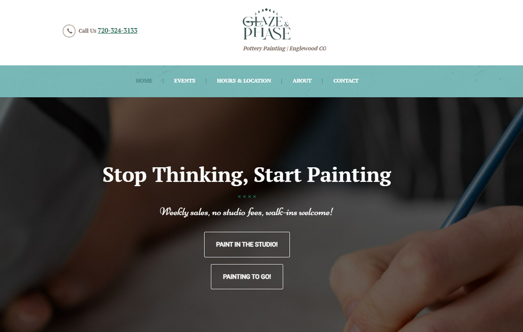
Key Features: easy navigation and clean website interface
Christina Limpalair started building Glaze & Phase from her passion for art. Her business offers pottery painting and creating classes on a first-come-first-serve basis. Various events and workshops are available for multiple age ranges to ensure student engagement.
Her website is one of the best teacher websites for offline learning sessions. It uses a white background with multiple images and clear CTAs for visitors. Plus, you can find clear information about the studio’s location, including a huge Google Maps thumbnail.
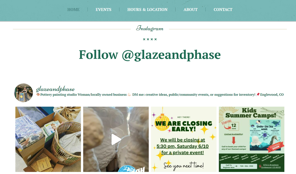
This teacher’s website shows the featured pottery products for sale, simultaneously exhibiting the instructor’s skill and art taste. Christina has also included more images in a sliding gallery to give a sneak peek of what her studio offers.
Then, at the end of the home page, she integrates the Glaze & Phase Instagram account into the website to increase engagement.
2. Movement Lab
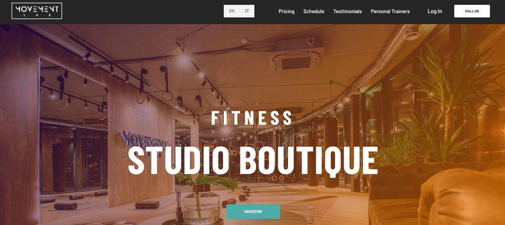
Key Features: membership feature and multilanguage website
Andrius Česnauskas has built the Movement LAB website to provide personal training services. It incorporates full-width images to display his fitness studio. The CTA with a contrasting color gives a clear direction of what people should do before joining any sessions.
When scrolling down, visitors can see the detailed steps to do so. This is a great example of providing an enjoyable user experience on your website, as it is informative and clear. It can also help boost conversions as visitors can take action directly after accessing the website.
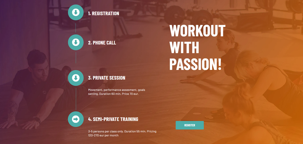
Andrius ensures that the website content can be accessed in two languages to reach a wider audience. Moreover, the Google Maps thumbnail on the footer section helps people to find the fitness studio’s location.
On the Personal Trainers page, you can also find the list of instructors along with the social media accounts to help visitors check their profiles. This way, Andrius builds customer trust by providing the online resume of the trainers.
3. Meghan Currie Yoga

Key Features: multiple full-screen images
Aside from teaching yoga, Meghan Currie is a professional artist. Her homepage contains full-width pictures with a CTA button leading to different pages, such as Course Catalog or About, making it easy for visitors to navigate the website.
She offers several courses, which clients can find on the Schedule menu. There, they can check the available dates and register directly on the website. Aside from that, she also highlights the 14-day free yoga learning she offers to attract more potential students.
At the home page’s end, she has embedded several blog posts to promote her featured podcast and relevant writings about yoga. A blog page on a teacher website like this is one of the best ways to apply SEO.
4. Kitchen Classroom
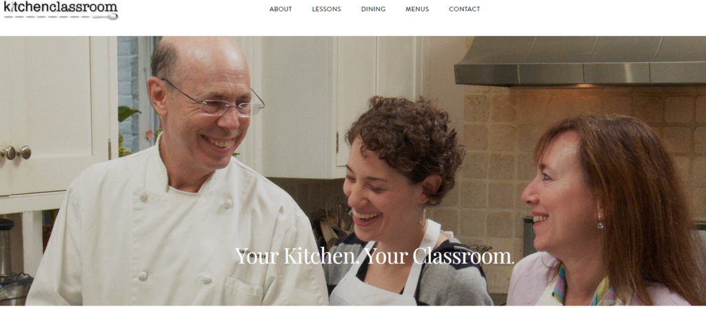
Key Features: simple design and straightforward interface
Executive Chef Jeff Seligman is the creator behind Kitchen Classroom. His website uses a minimalist layout and white background, displaying primary menus such as Lessons and Contact.
He offers on-site cooking lessons with two CTA buttons leading to the learning material details and a private dining option. This immediately lets potential customers know what to expect from the course. While the former provides more information about the classes, like learning tools and fees, the latter offers a home dining service.
You can see the name of a dish as you hover over its image, which greatly improves the user experience of someone who might not be familiar with the selection.
Furthermore, Jeff also provides a CTA that redirects to the detailed and complete dishes that students can learn and arrange as they wish. This customization option is an alternative way to reach a wider audience and attract more students.
Top Teacher Website Examples for Educational Blogs
If you want to start a blog, here are some of the best teacher blog examples to inspire you.
1. Neil Patel
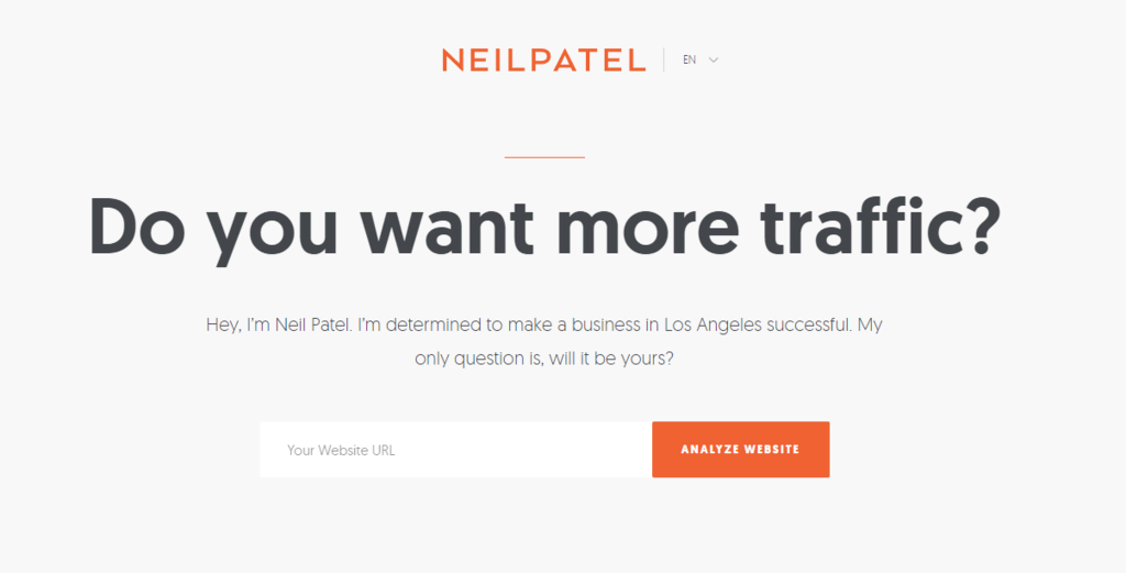
Key Features: good use of pop-ups and a clean interface
NeilPatel.com is one of the most popular blogs and digital marketing education websites, with over 1.5 million monthly traffic. It uses a clean white interface with orange text and buttons for highlights, strengthening the brand.
The homepage includes a tool with a search bar to check SEO issues that can affect your site rankings. Meanwhile, the blog section is a learning platform that provides digital marketing resources and learning materials for those looking to improve their SEO knowledge and ability.
Another notable website element is the two CTA buttons as answer options for the question asking if the visitors want more traffic. The Yes button redirects to the newsletter enrollment page, while the No button takes you to a site analysis offer page.
Both options let Neil promote his teaching skill and what he has to offer for a consultation. Consider applying the same strategy if you have a lot of materials to provide and want to boost conversion.

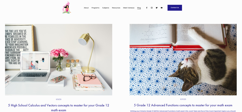
2. The Math Guru
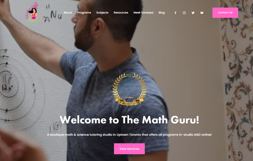
Key Features: engaging copywriting and straightforward interface
Through The Math Guru, Vanessa Vakharia aims to teach math and other relevant school subjects from a different perspective. The website’s home page maximizes copywriting to attract students, and the bold contrast between colors makes said copy stand out.
The blog section introduces learning tips and unique approaches to help students get an overview of the classes. Customer reviews are displayed at the bottom of the page to further convince potential students to join.
This teacher website’s blog page is arranged simply, giving visitors a clean and neat site to browse and easily find any information they need. Moreover, there is a separate Resource section where Vanessa shares her teaching materials and other tips on different platforms.
If you are creating educational content on multiple platforms, consider applying this approach to simultaneously improve your on-page and off-page SEO.
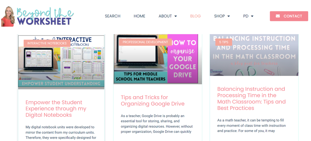
3. Beyond The Worksheet
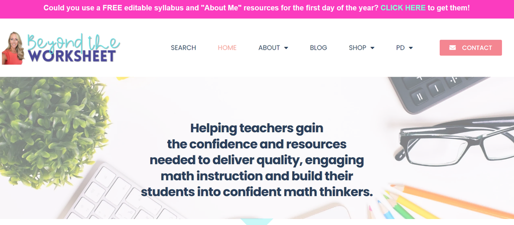
Key Features: informative blogs
Lindsay Perro uses her own website to provide premium and free resources for effective math teaching. She displays stock images edited to her blog’s style as the website’s visual elements.
As with most well-structured educational websites for teachers, visitors can browse downloadable education resources grouped by category. Aside from that, teachers can also read her blog page for multiple practical teaching tips using educational technology.
Another notable functionality on websites with many resources is a search bar. Beyond The Worksheet website’s search feature is embedded like a menu on the header.
4. Cult of Pedagogy
Key Features: minimalist design and multiple content types
Jennifer Gonzalez founded Cult of Pedagogy to share school learning tips from various teachers. It is a great website example for teachers who actively create content using multiple platforms. She divides them using a simple color-coded interface on the home page.
This teacher website’s blog page also divides blog categories into bigger umbrella topics using the same color-coded design as the home page.
When you scroll down, you can see the latest blog posts featured on the page. This strategy helps attract a regular audience through quality blog content, bringing more traffic to the new posts.
Pro Tip
Check out this article to learn how to write a blog post.
Top Art and Music Teacher Website Examples
Here are some great design examples for art and music teachers who want to create a website.
1. Creature Art Teacher

Key Features: newsletter subscription CTA
Aaron Blaise is a notable artist with years of experience. His website is a great example for those looking to create a simple website that stands out.
It uses a slider gallery to showcase his ongoing courses with contrasting color palettes and illustration images. All images are clickable to redirect visitors to the relevant enrollment page. This strategy also applies to creating conversions, as the visitor’s journey from seeing the information to checking out requires only a few steps.
Besides teaching, the artist also uses the website to display a virtual gallery of his art. He presents the work in a grid format, keeping people’s attention on the page. Using neutral colors as the background helps highlight the artwork.
2. Weronika Zubek

Key Features: clean and artistic web design
Weronika Zubek is a professional impressionistic artist who uses her website to channel her passion for painting, provide online art classes, and sell products. She keeps her website simple yet beautiful with images of her paintings.
It mainly uses pastel colors with bold shades to highlight the essential elements. Compared to Aaron’s website, Weronika uses more animation in how images appear as you scroll. She also puts a tiny CTA button on featured images to let visitors save them on Pinterest.
If you also want to emphasize product selling on your home page, consider utilizing this strategy to create conversions and let people save your art on their wishlist.
Weronika puts the Classes menu on her site’s header to tell the audience that she actively teaches painting and lettering. On this page, she also links her Instagram account for building social proof.
3. Ramsey Voice Studio
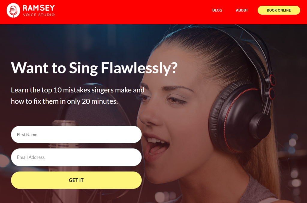
Key Features: subscription form
Matt Ramsey has taught singing lessons professionally for years and created Ramsey Voice Studio to offer coaching via online platforms. The teacher website uses a large image and a subscription form to attract and direct visitors to sign up for the program.
This vocal teacher shows credibility in three sections on the home page. He uses social proof, explains how he makes his lessons different from the others, and finishes by embedding customer reviews. Consider having these elements on a website to convince potential students of your teaching skill.
To top it all off, Matt also includes a blog covering singing tips and tricks, providing students with free educational resources.
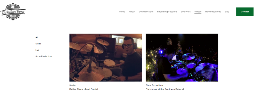
4. Christian Dorn Music
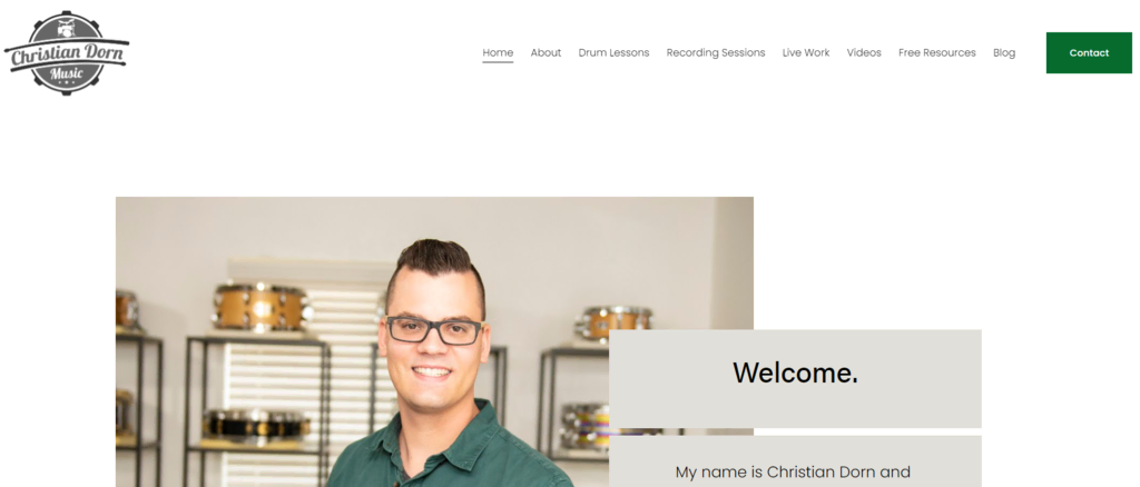
Key Features: informative pop-up and hero videos
Based in Texas, Christian Dorn Music was created by Christian Dorn, a musician and professional drummer, to offer services like drum lessons and recording sessions.
This teacher website has a pop-up window containing a promotion to attract students and boost sales. It also displays his work through videos, showcasing his expertise in playing the drums, which is great for increasing credibility.
On the drum lesson enrollment page, Christian also provides several information fields to fill in, asking about the student’s biodata, current drum mastery, and desired lesson schedule. By collecting this information upfront, teachers can achieve better schedule arrangements and more efficient preparation of the learning materials.
Top Website Examples for Teacher Portfolios
If you want to present your work experience and background in a unique way, try creating a teacher portfolio. The following are some teacher portfolio websites to inspire you.
1. Gretchen C. Seibel
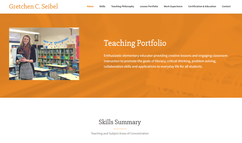
Key Features: informative content
Gretchen C. Seibel is an experienced teacher who created an online portfolio using a website, displaying her work experience, philosophy, and lesson examples.
Her site is like a landing page with a basic interface and bright color palettes that highlight important sections. Gretchen displays each piece of information in multiple detailed paragraphs and unordered lists, helping visitors understand her expertise and background.
Single-page websites like this let visitors scan what they need faster. Moreover, they are more optimized for mobile devices and easier to manage.
2. Kale Barnes
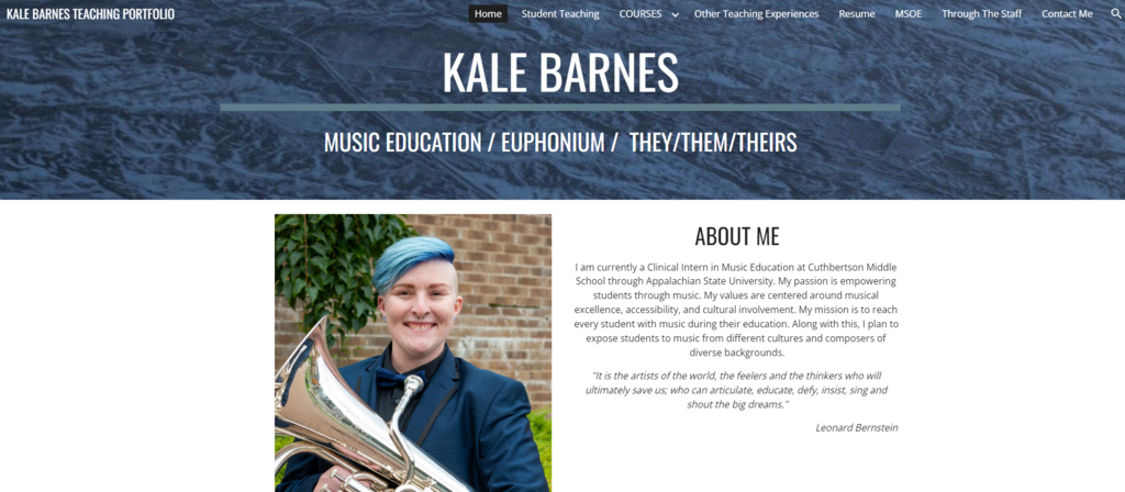
Key Features: educational content
Kale Barnes is a clinical intern who mainly teaches music to middle school students. The website has a basic interface yet contains useful resources for other teachers.
Once visitors access it, they’ll find a short description of Kale Barnes along with its mission and values. The website also includes Kale’s resume, so it’s easier for visitors to read the profile summary.
If you prefer having a portfolio website that incorporates a lot of writing like Kale’s, using a white background is a great choice to improve readability.
3. Tamara Nozik
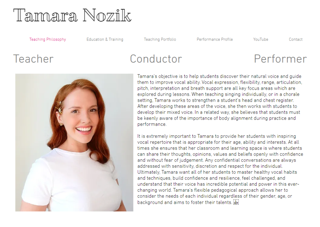
Key Features: subtle effect to enhance the user experience
Tamara Nozik is a professional vocal coach who wants to help her students improve their natural voices. Her website utilizes a minimalistic design and white background with a subtle animation effect every time visitors switch to a different page.
On top of that, Tamara displays media mentions, past performances, and singing videos to strengthen her credibility and customer trust.
She uses a cheerful yellow background color on the YouTube and Lessons page, making them contrast the other pages on the site. She uses this strategy to match her class’ name, Happy Singing, and strengthen branding.
Consider applying the same strategy to set the audience’s mood when visiting your page. However, avoid incorporating too many different colors as it can harm readability and user experience in general.
4. Curtis Stedge
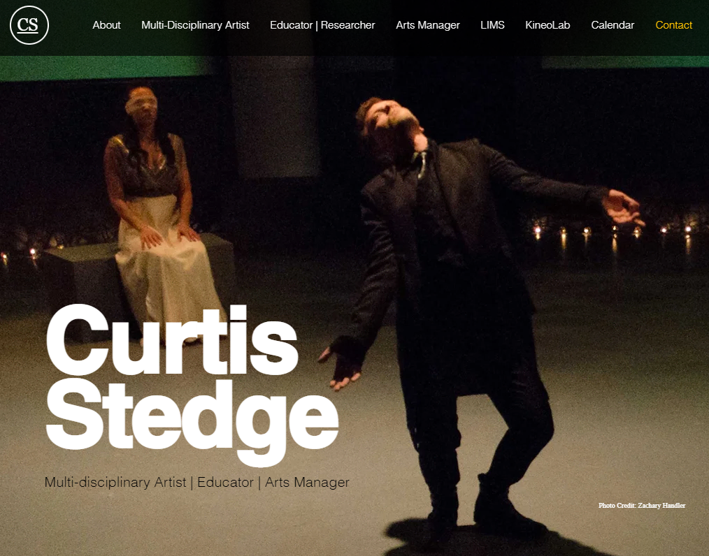
Key Features: hero image
Curtis Stedge is a multi-disciplinary artist, educator, and professional dancer. This teacher’s website displays a visually appealing image on the homepage to catch the visitors’ attention. It also showcases his choreography works by showing pictures and videos from the performance.
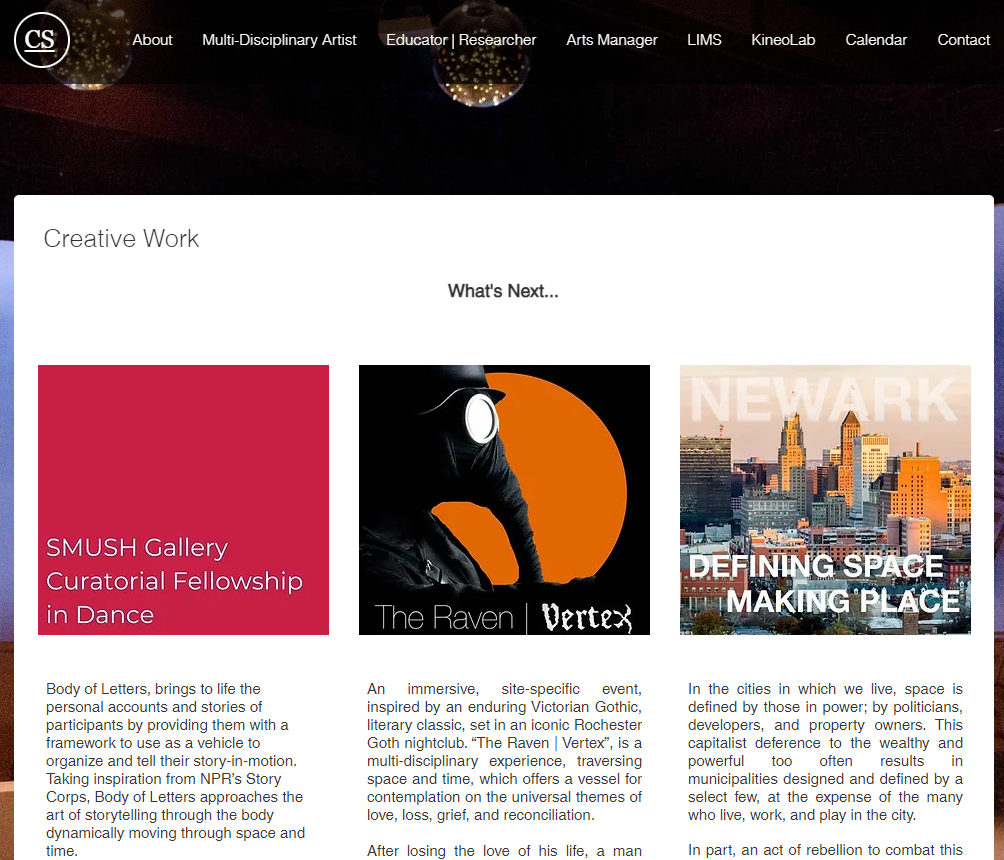
Additionally, he provides a Teaching Portfolio menu that allows visitors to download his documented professional journey and dance education syllabuses. Prospective students can also read more about his philosophy and commitment to diversity and inclusion there.
If you prefer incorporating more featured images and writings at the same time, this teacher website is a great example to display both elements nicely.
Displaying text in a white area will make it easier for your visitors to read, while at the same time, you can also showcase your work in an image. This strategy also lets you have fewer web pages on a site, which can positively impact performance.
Why Should a Teacher Create a Website
Regardless of your teaching experience, creating a teacher website is essential to improve your career. Here are the benefits of building a website for teachers:
- Get new customers – you can reach a bigger audience and earn extra income by selling your services online.
- Build a brand – creating an engaging website improves brand awareness, and implementing search engine optimization (SEO) strategies helps increase organic traffic.
- Enhance communication – a website lets you connect and share valuable information with fellow teachers and students.
- Improve authority – sharing your personal and professional journey can enhance your credibility. Ensure to avoid bad website design to help you form a good impression on your potential students.
- Display expertise – building a teacher website is a great way to display your background and expertise, as you can make it attractive to improve visitor engagement.
- Additional resources – with a teacher website, you can upload lesson or curriculum examples, papers, and performance videos to inspire fellow teachers.

Conclusion
Apart from advancing your career, a teacher website can help you get new clients, build brand awareness, connect with teachers and students, enhance your credibility, display your skills, and provide alternative resources for fellow teachers. Below are our best picks from each category:
- For online courses – Dr. Deb Therapy
- For offline services – Movement Lab
- For educational blogs – Neil Patel
- For art and music teacher – Weronika Zubek
- For teacher portfolios – Gretchen C. Seibel
We hope this article inspires you to create a teacher website. If you have any questions or suggestions, please leave them in the comments section below.

Larassatti Dharma is a Content Writer with 2+ years of experience in the web hosting industry. She’s also a WordPress contributor who loves to share helpful content with others. When she's not writing, Laras enjoys learning foreign languages and traveling. Follow her on LinkedIn