Zyro Website Builder Is Now Fully Integrated With Hostinger: Achieve More With One Tool
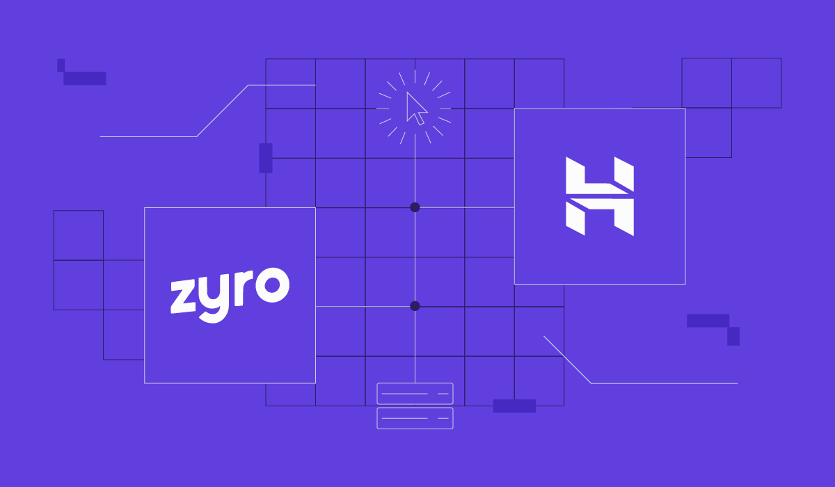
In a significant move to enhance and expand our web hosting services, we are excited to announce the integration of Zyro with Hostinger. This strategic alliance signifies a major milestone as all Zyro services and clients have successfully transitioned to Hostinger.
From now on, all Zyro clients can continue their online journey with Hostinger Website Builder. It combines Zyro’s user-friendly website-building capabilities with Hostinger’s robust hosting solutions.
Thanks to this change, we can improve and develop both our web hosting and building services. We firmly believe that offering a one-stop shop for web development delivers the best value to our customers.
“Our mission is to develop IT services and products enabling entrepreneurs to achieve their goals online successfully. With Zyro’s team expertise, we can take that mission a step further. This integration brings together the best of both companies, combining Hostinger’s hosting expertise with Zyro’s experience in developing website builder platforms to offer customers a seamless experience”, says Daugirdas Jankus, the CEO of Hostinger.
Currently, all sales and services of Zyro are discontinued. If you used to be a Zyro client and have any questions or need help, our Customer Success team is here for you at all times. You can also refer to this knowledge base article for more details regarding the migration.
Scale Your Online Presence
As Hostinger Website Builder blends user-friendly website-building capabilities with robust hosting solutions, all Zyro clients will now enjoy:
- Smoother site management. Manage your websites, domains, web hosting plans, business emails, and more from one dashboard.
- More innovative AI tools. Use our AI technology to build a brand new website in minutes from scratch. Let AI craft unique and SEO-friendly blog posts, pages, and images for your site, or update your brand with a new bespoke logo.
- Better user experience. Access in-depth tutorials directly from the dashboard, or chat with our Customer Success team any time.
Whether you’re a small business owner, a freelancer, or a creative individual, we will help you create and maintain your dream website.
AI-Powered and Mobile-Friendly Website Development
With Hostinger Website Builder, you can generate a fully functional site by briefly describing your idea. Share your brand name, tell us what it does, and watch as AI creates a website or a landing page.
The best part? You can generate up to 100 websites and customize them using a drag-and-drop editor.
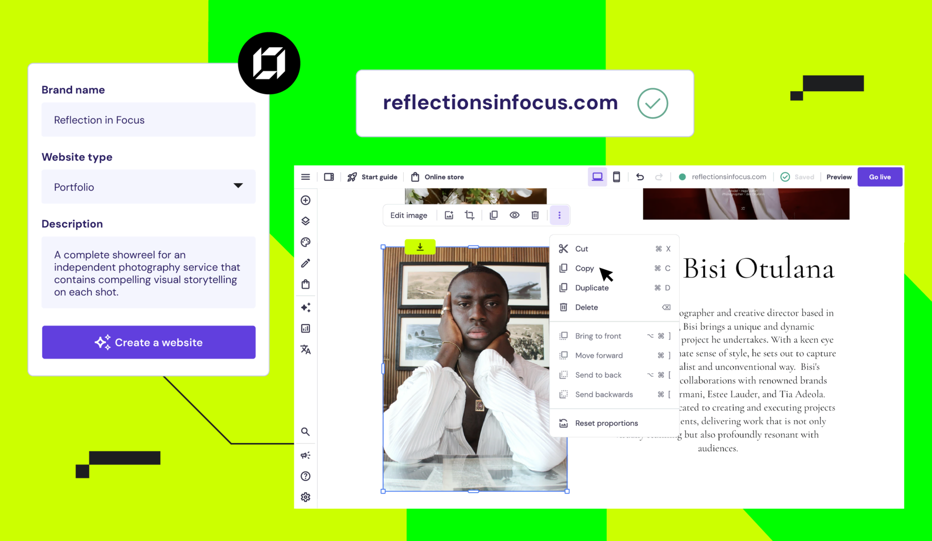
With our mobile editor, you can make changes to your website with just a smartphone – no need to look for a computer once you notice something needs to be fixed.
Top Customer Support
Get access to renowned customer support, no matter your query. With Hostinger, you can expect a response in less than three minutes, expert assistance, and multilingual support.
You can access it all via live chat – no need to submit a ticket or write an email.
Extensive Learning Resources
Get access to a wealth of educational materials, including detailed tutorials, a comprehensive knowledge base, and informative videos from Hostinger Academy.
Besides covering topics like your website maintenance and development, we also share tips on marketing and eCommerce strategies to help you reach the full potential of your online business.
Ready to experience the next level of website building? Try Hostinger Website Builder today.

Matleena is a seasoned Content Writer with 5 years of content marketing experience. She has a particular interest in emerging digital marketing trends, website building, and AI. In her free time, Matleena enjoys cups of good coffee, tends to her balcony garden, and studies Japanese. Follow her on LinkedIn


Comments
January 14 2024
Hi I have started building my portfolio on Zyro. I am still on Zyro assuming my account is not migrated yet. I hope my data will not be lost as I have move substantially forward in my portfolio making. Please reply at your earliest... Thank you.
January 25 2024
Hello! It seems you may not have been migrated yet, but no worries – your progress on Zyro should be safe. Once the migration occurs, both websites connected to your account will be moved to Hostinger. If you have any concerns or need further assistance, feel free to reach out 🙏